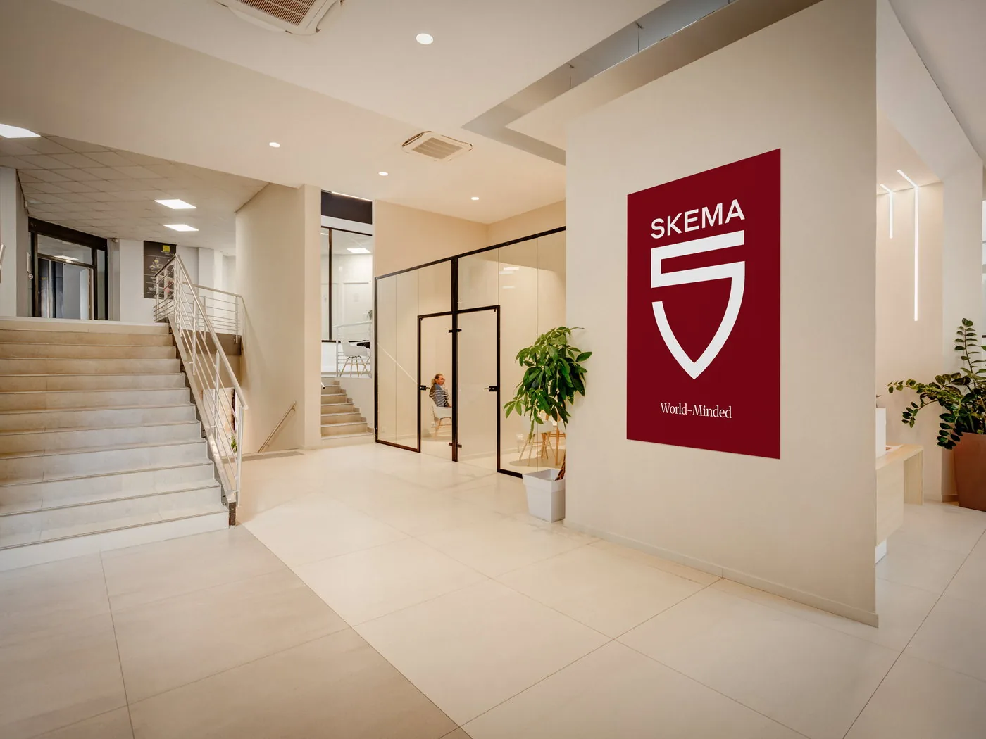
The tagline

World-Minded




It captures the mindset that drives us. It gives shape to a purpose built on openness to the world; an ambition that connects cultures, disciplines, and perspectives to drive new ways of thinking.
The tagline
It captures the mindset that drives us. It gives shape to a purpose built on openness to the world; an ambition that connects cultures, disciplines, and perspectives to drive new ways of thinking.
The emblem
It is the most distinctive mark of SKEMA's identity. Simple and singular in its construction, it expresses the brand's foundations and its openness to the world. Its design brings together three founding principles.

It echoes the five inhabited continents that make up SKEMA's international footprint.

A universal symbol of great academic institutions, it places SKEMA firmly within a tradition dating back to 1892.

Woven into the heart of the design, it represents SKEMA's initial.
One global brand, two schools
The color palette
#820816
The Red Signature is the primary color of SKEMA and SKEMA Business School. Deep and distinctive, it embodies the brand's strength, academic heritage, and international ambition.
#ED3248
The Red Pulse identifies SKEMA School of Professional Studies. Brighter and more dynamic, it embodies agility, evolving skills, and lifelong learning.
Our colors reflect the brand's founding principles: excellence, openness, and modernity.
SKEMA's new visual identity gives shape to a bold, singular brand, one built to stand out anywhere in the world.